【共享】GraphPad Prism-Transheep力荐SCI统计插图制作神器
丁香园论坛
2533
Transheep小编发现GraphPad Prism不仅简单易学而且可以搞定大部分医学研究所需的统计与作图,所以今天总结了几种常用统计图的做法,教您轻松快速地做出漂亮的统计图,您只需花很少的时间看完这个教程就可以彻底摆脱excel笨拙的作图功能了。废话不多说让我们正式开始。
1. 折线图
折线图最为统计图中很常见的一类图,它的特点是可以显示随时间而变化的连续数据,因此每个数据点都有一个相应的X轴值和Y轴值,所以我们在用graphpad做折线图时在数据表类型的选择上一般选XY图(XY graphs)。如下文实例。
1.1 根据Table1的1组原始数据(4个样本在4个时间点分别测得的OA值)做折线图
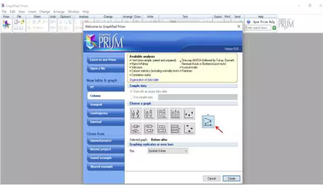
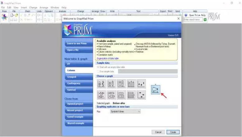
<center> <font>打开</font><span><font>Graphpad prism</font></span><font> 5</font><font>软件,选择XY图(XY graphs),折线图图标,因为是原始数据,需要软件帮你计算均值和误差,因此你要告诉软件你的Y值的样本数是多少,这边的样本数是4,因此我们把样本数设为4,如下图</font></center>
在Data分栏中将数据粘贴进去,如下图
软件就会自动帮你算出均值和误差值,并做好折线图,把字体和坐标轴方向改成你想要的格式后,如下图一幅漂亮的折线图就做好了,简单吧?
1.2 根据Table2的原始数据(治疗组和对照组的4个样本在4个时间点分别测得的OA值)做折线图
打开insert 菜单的NewData Table功能,加入一张新的数据表,见下图
仍然选择XY图(XYgraphs),告诉软件样本数是4
在Data栏中输入数据
软件已经自动帮你把图做好了,稍微美化后得下图
1.3 用已经处理好的1组数据做折线图
如果你的数据是用其他软件(excel,origin,etc..)已经处理过的,Graphpad prism也可以帮你完成剩下的作图工作,你只需告诉软件你输入的数据是已经计算好的就行了,比如你想用Table3的1组数据做折线图
Table3
新建一个数据表,仍然选择XY图(XYgraphs),告诉软件你输入的是计算好的值,见下图
在data栏中粘贴数据,如下图
打开Graphs栏目下的Data3,看到软件已经做好了图,稍微调整一下字体的大小,就可以得出下图所示的折线图了
1.4 用已经处理好的2组数据做折线比较图
如果要用Table4所示的两组已经处理好的数据作图,步骤和1.3的一样。
仍然选择XY图(XYgraphs),告诉软件你输入的是计算好的值,见下图
将数据粘贴进去
软件即时生成的图如下图所示
折线图的处理讲完了,简单吧,让我们来看看柱状图怎么做
2. 柱状图
柱状图可以很直观地表示出不同组别之间的数值差异,和折线图不同的一点是它的X轴对应的是组别而不是数值,因此在GraphPad分类栏的选择上也有所不同,见下文的实例
2.1根据Table 5的原始数据做柱状图
Table 5
选择Column graphs栏,因为该栏默认输入的都是原始数据,因此没有输入样本数的地方,只需选择数据处理类型为(Mean&SD), 如下图。
在Data分栏中输入以下数据
软件就会自动帮你算出均值和误差值,并做好柱状图,见下图
2.2 根据Table6的原始数据做两组数据比较的柱状图
Table 6
这次因为涉及到两组数据比较,所以我们选择grouped栏,图表类型选择柱状图,因为Grouped栏并不是像Column graphs栏一样默认输入的是原始数据,因此有输入样本数的地方,这边的样本数是4,因此我们相应地设置样本为4,见下图。
在Data分栏中输入以下数据
软件会自动帮你做好一幅漂亮的分组柱状图,如下图。
2.3如果你的数据是已经处理过的数据也可以直接导入或拷贝到Graphpad,现在我们用Table7中的数据做一个柱状图
Table 7
仍然选择Grouped栏,告诉软件你输入的值是已经计算好的,如下图
软件及时生成柱状图,如下图
2.4 用两组计算好的数据做一个两组比较的柱状图
用Table 8的数据做成两组比较的柱状图
操作步骤和2.3一样,只需多输入一组数据,仍然选择Grouped栏,告诉软件你输入的值是已经计算好的,如下图
在data栏中输入数据
软件即时生成的图如下图
折线图和柱状图的处理都讲完了,在graphpad数据表类型的选择上小编总结出了2条规律
一. 折线图,散点图这种有一一对应的X,Y值一般都选择XY栏
二. 柱状图,箱型图这种有组别的数据需要用软件计算的选择column栏,处理加工过的数据一般选择group栏。
3. 组合和导出图片
点击layout栏,出现下图所示界面
根据你的图片的数量,选择合适的布局,下图选择的是6张图分成3排排列
将做好的图片拖到对应的方格中,用添加文章工具加入图片编号,完成后如下图所示
然后导出图片
点击File目录下的Export,出现下图所示的界面,选择好符合相关SCI杂志要求的格式,分辨率和宽度,如下图
点击ok,一张漂亮的可以直接拿去投稿的组合图就做好了,见下图
是不是觉得很简单呀?你也赶快去试一试吧。
GraphPad Prism下载地址:http://www.cr173.com/soft/37875.html#address
1. 折线图
折线图最为统计图中很常见的一类图,它的特点是可以显示随时间而变化的连续数据,因此每个数据点都有一个相应的X轴值和Y轴值,所以我们在用graphpad做折线图时在数据表类型的选择上一般选XY图(XY graphs)。如下文实例。
1.1 根据Table1的1组原始数据(4个样本在4个时间点分别测得的OA值)做折线图
| Time (days) | <center> <font>OA</font></center> | |||
| 0. | 0.942 | 0.846 | 0.691 | 0.515 |
| 4. | 0.717 | 0.836 | 0.653 | 0.483 |
| 24. | 0.408 | 0.367 | 0.342 | 0.231 |
| 48. | 0.451 | 0.409 | 0.335 | 0.196 |
<center> <font>打开</font><span><font>Graphpad prism</font></span><font> 5</font><font>软件,选择XY图(XY graphs),折线图图标,因为是原始数据,需要软件帮你计算均值和误差,因此你要告诉软件你的Y值的样本数是多少,这边的样本数是4,因此我们把样本数设为4,如下图</font></center>
在Data分栏中将数据粘贴进去,如下图
软件就会自动帮你算出均值和误差值,并做好折线图,把字体和坐标轴方向改成你想要的格式后,如下图一幅漂亮的折线图就做好了,简单吧?
1.2 根据Table2的原始数据(治疗组和对照组的4个样本在4个时间点分别测得的OA值)做折线图
| Time (days) | <center> <font>Control</font></center> | <center> <font>Treated</font></center> | ||||||
| 0. | 0.717 | 0.942 | 0.691 | 0.303 | 0.942 | 0.846 | 0.691 | 0.515 |
| 4. | <center> <font>0.836</font></center> | 0.527 | 0.988 | 0.321 | 0.717 | 0.836 | 0.653 | 0.483 |
| 24. | 0.653 | 0.401 | 0.691 | 0.169 | 0.408 | 0.367 | 0.342 | 0.231 |
| 48. | 0.483 | 0.342 | 0.776 | 0.917 | 0.451 | 0.409 | 0.335 | 0.196 |
仍然选择XY图(XYgraphs),告诉软件样本数是4
在Data栏中输入数据
软件已经自动帮你把图做好了,稍微美化后得下图
1.3 用已经处理好的1组数据做折线图
如果你的数据是用其他软件(excel,origin,etc..)已经处理过的,Graphpad prism也可以帮你完成剩下的作图工作,你只需告诉软件你输入的数据是已经计算好的就行了,比如你想用Table3的1组数据做折线图
Table3
| <center> <font>Time (days)</font></center> | <center> <font>OA</font></center> | |
| <center> <font>Mean</font></center> | <center> <font>SD</font></center> | |
| 0. | 1.000 | 0.17 |
| 4. | 1.725 | 0.21 |
| 24. | 2.133 | 0.41 |
| 48. | 1.859 | 0.56 |
在data栏中粘贴数据,如下图
打开Graphs栏目下的Data3,看到软件已经做好了图,稍微调整一下字体的大小,就可以得出下图所示的折线图了
1.4 用已经处理好的2组数据做折线比较图
如果要用Table4所示的两组已经处理好的数据作图,步骤和1.3的一样。
| <center> <font>Time (days)</font></center> | <center> <font>Control</font></center> | <center> <font>Treated</font></center> | ||
| <center> <font>Mean</font></center> | <center> <font>SD</font></center> | <center> <font>Mean</font></center> | <center> <font>SD</font></center> | |
| 0. | 1.000 | 0.17 | 3.604 | 0.31 |
| 4. | 1.725 | 0.21 | 2.534 | 0.43 |
| 24. | 2.133 | 0.41 | 3.381 | 0.74 |
| 48. | 1.859 | 0.56 | 3.913 | 0.93 |
将数据粘贴进去
软件即时生成的图如下图所示
折线图的处理讲完了,简单吧,让我们来看看柱状图怎么做
2. 柱状图
柱状图可以很直观地表示出不同组别之间的数值差异,和折线图不同的一点是它的X轴对应的是组别而不是数值,因此在GraphPad分类栏的选择上也有所不同,见下文的实例
2.1根据Table 5的原始数据做柱状图
Table 5
| Control A | Control B | |
| Sample1 | 0.942 | 0.717 |
| Sample2 | 0.846 | 0.836 |
| Sample3 | 0.691 | 0.653 |
| Sample4 | 0.515 | 0.483 |
在Data分栏中输入以下数据
软件就会自动帮你算出均值和误差值,并做好柱状图,见下图
2.2 根据Table6的原始数据做两组数据比较的柱状图
Table 6
| <center> <font>Group A</font></center> | <center> <font>Group B</font></center> | |||||||
| <center> <font>Control</font></center> | 0.942 | 0.846 | 0.691 | 0.515 |
, 0.717 |
0.836 | 0.653 | 0.483 |
| <center> <font>Treated</font></center> | 0.408 | 0.367 | 0.342 | 0.231 | 0.451 | 0.409 | 0.335 | 0.196 |
在Data分栏中输入以下数据
软件会自动帮你做好一幅漂亮的分组柱状图,如下图。
2.3如果你的数据是已经处理过的数据也可以直接导入或拷贝到Graphpad,现在我们用Table7中的数据做一个柱状图
Table 7
| Control | Mean | SD |
| A | 1.000 | 0.17 |
| B | 1.725 | 0.21 |
| C | 2.133 | 0.41 |
| D | 1.859 | 0.56 |
软件及时生成柱状图,如下图
2.4 用两组计算好的数据做一个两组比较的柱状图
用Table 8的数据做成两组比较的柱状图
| <center> <font>Control</font></center> | <center> <font>Treated</font></center> | |||
| <center> <font>A</font></center> | 1.000 | 0.17 | 3.604 | 0.31 |
| <center> <font>B</font></center> | 1.725 | 0.21 | 2.534 | 0.43 |
| <center> <font>C</font></center> | 2.133 | 0.41 | 3.381 | 0.74 |
| <center> <font>D</font></center> | 1.859 | 0.56 | 3.913 | 0.93 |
在data栏中输入数据
软件即时生成的图如下图
折线图和柱状图的处理都讲完了,在graphpad数据表类型的选择上小编总结出了2条规律
一. 折线图,散点图这种有一一对应的X,Y值一般都选择XY栏
二. 柱状图,箱型图这种有组别的数据需要用软件计算的选择column栏,处理加工过的数据一般选择group栏。
3. 组合和导出图片
点击layout栏,出现下图所示界面
根据你的图片的数量,选择合适的布局,下图选择的是6张图分成3排排列
将做好的图片拖到对应的方格中,用添加文章工具加入图片编号,完成后如下图所示
然后导出图片
点击File目录下的Export,出现下图所示的界面,选择好符合相关SCI杂志要求的格式,分辨率和宽度,如下图
点击ok,一张漂亮的可以直接拿去投稿的组合图就做好了,见下图
是不是觉得很简单呀?你也赶快去试一试吧。
GraphPad Prism下载地址:http://www.cr173.com/soft/37875.html#address


![[精选]SCI论文写作投稿资料包:100+资料& 投稿答疑30问](https://img1.dxycdn.com/p/s14/2023/1105/569/6102685706544601271.jpg!wh200)